UI/UX is that part of video games that often goes unnoticed when it’s good, but when developers fail to pay proper attention to the game UX design and interface, the result can be damning.
Even games by big-name companies suffer from bad UI/UX game design: one of the recurring complaints about BioWare’s 2019 title Anthem was its confusing interface.
In our years on the market, we at Mind Studios Games have seen UI/UX put on a back burner by developers, resulting in criticism from players and even commercial losses.
So, this article is about UX/UI for mobile gaming and why you shouldn’t neglect this aspect of development.
Since we're a mobile game development company, we will focus mostly on UI/UX for mobile games. The UI/UX issues in console and PC games will sometimes overlap with mobile ones, but there are also platform-specific differences in approach.
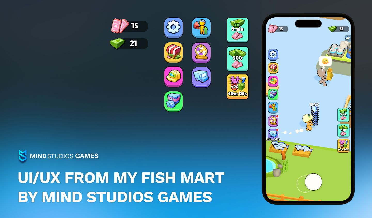
If you’re planning to create a mobile game and have questions about UI/UX, we hope this article about mobile game UX design will help you. It’s a result of our years on the market developing mobile games in a variety of genres and types, many of which require different approaches to UI/UX design in video games.
Key principles of mobile game UX design
Let’s start off with the basics.
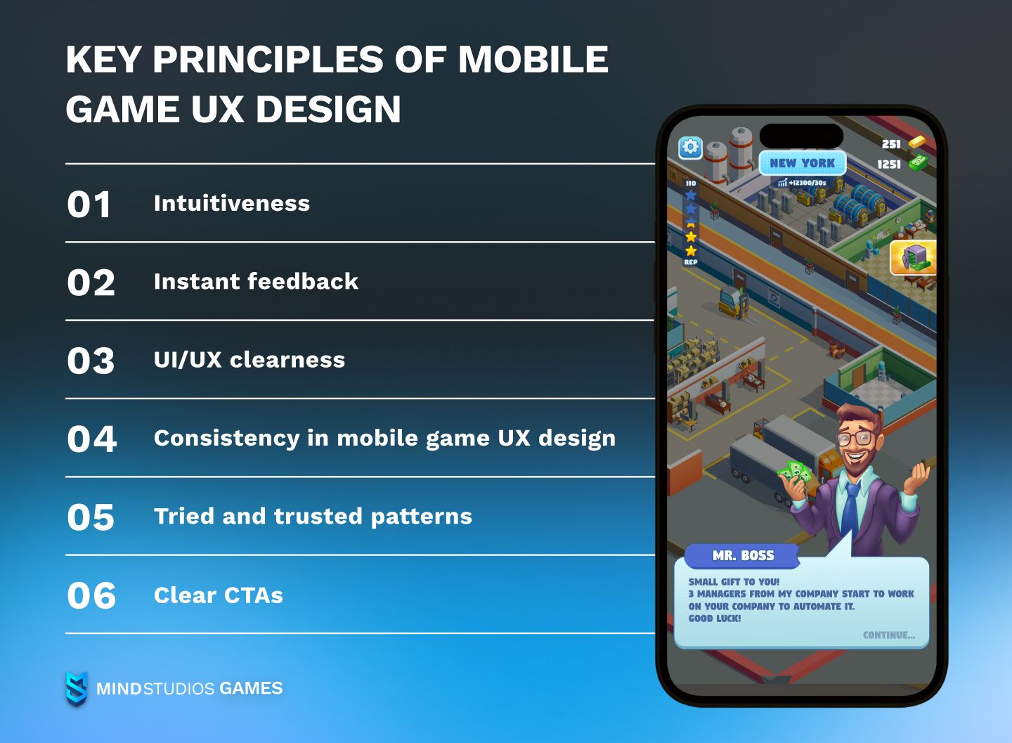
The video game UX design for mobile devices combines the principles of interface and UX for video games in general with the specifics of mobile devices. Mobile games face certain constraints due to smaller screen sizes and lower performance, and that obviously affects the game app design. Here are the key principles our UI/UX designers follow.
Intuitiveness
This should, in our humble opinion, be the key trait for all games, regardless of platform, but it is absolutely vital for mobile games. Many mobile gamers aren’t hardcore gamers familiar with traditional gaming conventions. Instead, they’re well-versed in navigating non-gaming mobile apps.
Employing in your video game UX design the actions users take when interacting with other apps will make it more engaging and attractive to players. This includes navigating menus with as few taps as possible, employing easy-to-grasp movement mechanics, etc.
Instant feedback
What we mean here is that when you design a game, think about the ways you can provide instant confirmations for players’ actions. You can use small animations, sounds, vibrations, or pop-up messages. Otherwise, the game might become confusing to players.
UI/UX clearness
Small smartphone screens limit the number and size of buttons and menus to comfortably put on the screen. Too cluttered a screen will be hard to navigate for players, resulting in poor user experience.
In general, follow the principle “fewer is better” — if you can do without displaying an element on the screen at all times, do so. Instead of pouring all elements onto the player right away, add them gradually. This will help players get used to the game and will enhance their experience.
Consistency in mobile game UX design
This is true for any kind of game as well as for non-gaming apps. Too many colors, fonts, and buttons of different shapes will put off many users as it makes the game confusing and overwhelming. Choose at most two fonts to use in the interface, and limit the colors of menus to 3–5 at most.
Tried and trusted patterns
While it’s important to be innovative and unique to stand out from competitors in a market as saturated as mobile games, gaming UX and UI is hardly the best place for that. Research your target audience and the games they play, and follow the example when placing the interface elements. By making the game interface seem familiar to players, you entice them to stay longer.
Clear CTAs

You need to design the UI/UX in your game around the idea of players’ decision-making process being as simple as possible. One of the principles here is that CTA buttons for different actions shouldn’t look the same.
For example, if you’re making the main CTA green, make CTAs for rewarded ads and paid perks in different — preferably contrasting — colors. This will help make in-game navigation clearer for players and will likely increase their satisfaction. Higher satisfaction leads to better retention and longer player lifetime.
Challenges in mobile game UX design
What to keep in mind when creating UX for mobile games? Here are some not-so-hidden but sometimes overlooked pitfalls.
#1 A wide range of screen sizes and resolutions
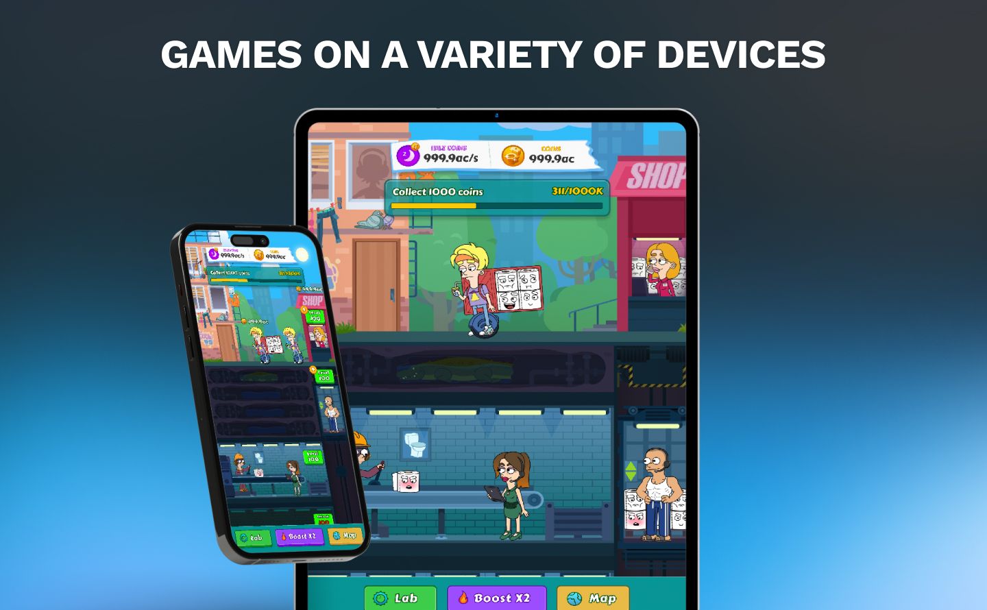
Even if you’re only aiming for smartphones and not tablets, for example, there’s still a huge pool of devices with different screens. Failing to account for that when creating your game’s UI and UX might result in UI elements being “swallowed” by the device’s edges, for example.
Accounting for different screen sizes will include limiting your on-screen elements, scaling and anchoring elements, creating layout groups, etc.
#2 Touchscreen challenges
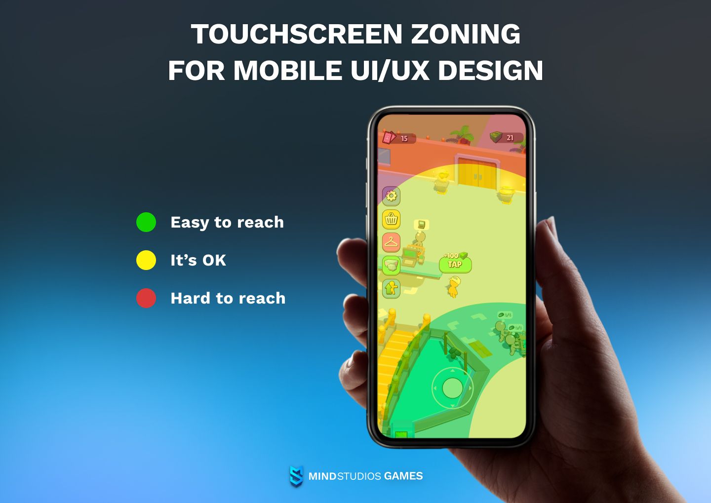
We typically navigate our smartphone screens with one or both thumbs, and those fingers aren’t the longest ones on our hands. Mobile games are the type of apps where touch screens pose a substantial challenge due to the necessity to actively tap, swipe, and pinch the screen to play. Which is why specialists in UX design in mobile video games employ zoning when they place interface elements on the screen.
Here’s an example:
#3 Accessibility and user-centric design principles
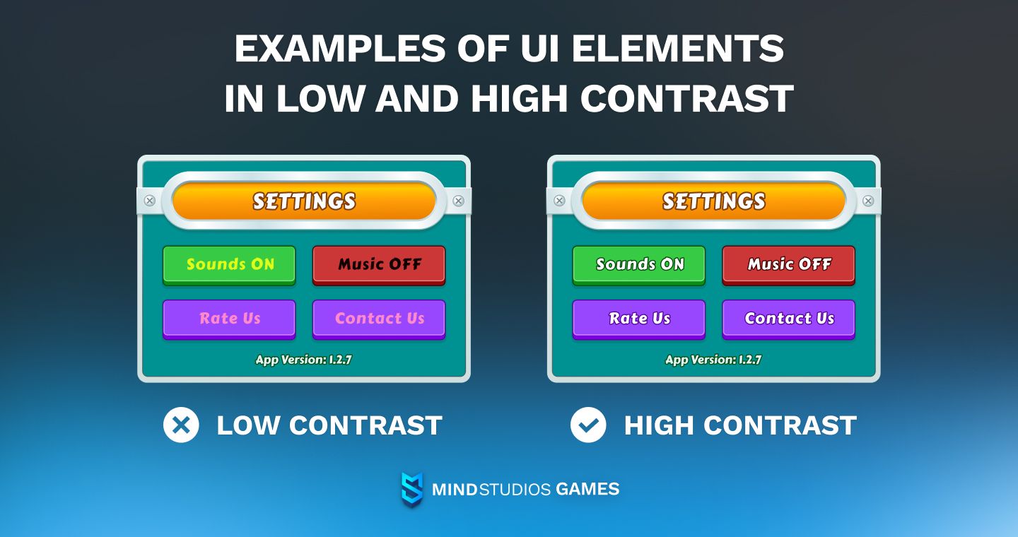
Some of your mobile game’s players will have disabilities, and you need to account for that. Introduce adjustable text sizes and high-contrast themes, if possible. Controls sensitivity is another option to include. Since mobile games are often colorful and sometimes rely on color to distinguish commands, you might also want to add elements for color-blind users.
A tip in the realm of touch controls: when you design an interface, consider that some people are left-handed. You may offer a mirrored design option for them.
#4 User distraction
Playing games isn’t the mobile devices’ primary function. When designing a game for smartphones, think about players receiving a call. You can choose to roll your game into background automatically, or you can design in a way that the player will see the “Answer” and “Decline” buttons that will hover over your game. Players will be able to decide if they want to take the call or continue playing.
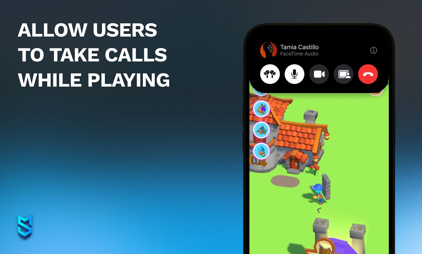
Moreover, with more smartphone models supporting split screens these days, you can also think about UX in case the game takes up only half of the space. With this, players might stay in the game for longer, simultaneously talking to someone and playing. Win-win!
#5 Landscape mode
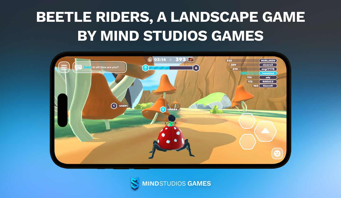
Unlike non-gaming apps, mobile games can be made for landscape mode. Landscape mode offers more immersion, which promotes longer in-game sessions, although the number of sessions is typically lower. If your mobile game’s genre is aimed at longer sessions — plot-driven games, RPGs, semi-complex shooters, and many others — it’s better to design it in landscape mode.
However, the mobile game UX design for landscape games will differ from UX for portrait mode due to differences in players’ patterns of action. For starters, playing in landscape generally involves both hands, like with a console controller. Hence, the placement of buttons and controls will be entirely different.
Impact of UX on player retention and monetization of mobile games
Never underestimate the value of UX design in games when it comes to keeping players in the game and monetizing them.
The cluttered interface and frustrating user experience contributed to negative reviews and player backlash of Final Fantasy: All the Bravest, one of the Square Enix’s big failures in the Final Fantasy franchise. That was in 2013.
Five years later, in 2018, a title in another popular franchise, The Walking Dead: Our World, faced huge backlash for its unintuitive menu navigation. This, among other things, led it to poor user retention.
Not to linger on the negatives, though 😃 So, how can good UI/UX help your game? (And you can find prominent success stories in a section below.)
Here are the things UX in video games can do to increase player retention:
| Onboarding | It’s incredibly important for mobile games to catch players’ attention right away. A well-designed onboarding process helps new players understand the game mechanics quickly, reducing frustration and increasing retention. |
| First impressions | A smooth and engaging UX can make a strong first impression right after the onboarding, increasing the likelihood that players will continue playing the game. |
| User engagement | Intuitive controls, clear feedback, and immersive experiences enhance user engagement, keeping players invested in the game for longer periods. |
Retaining players is less expensive than acquiring new ones, so improving retention through a better UX indirectly boosts monetization. Engaged and loyal players are more likely to make repeat purchases and contribute to long-term revenue. If you continue to pay due attention to UI/UX when setting up your monetization strategy, you can win big time here.
Finally, quality UI and UX design for video games can be your ticket to free marketing, since positive user experiences lead to favorable word-of-mouth recommendations and reviews. (And negative experiences can bring a lot of damage, as proven by examples at the beginning of this section.)
UX trends and technologies in mobile game development
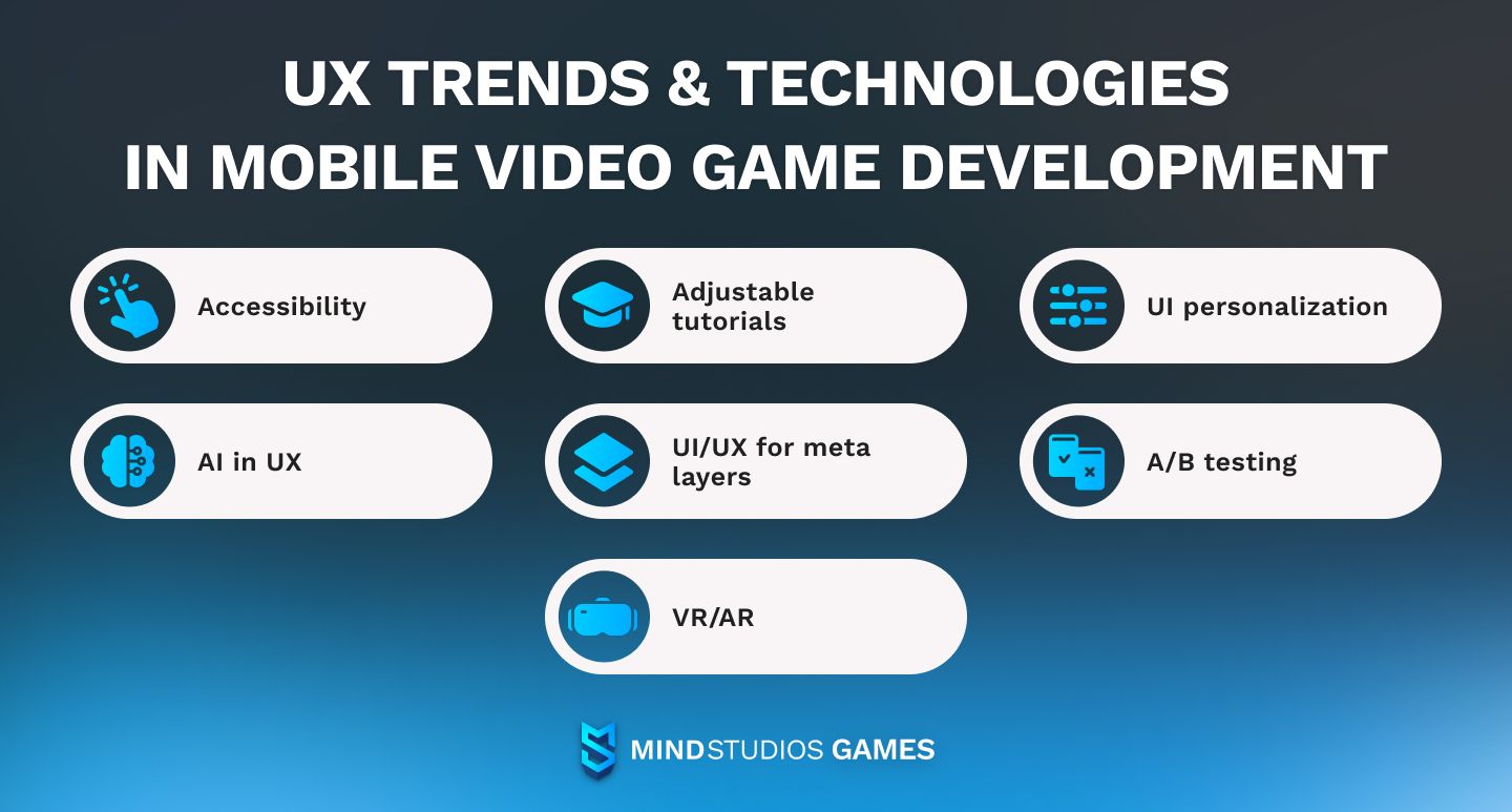
Here’s a list of things we believe anyone involved in UX for mobile games should keep an eye out for.
Accessibility
We mentioned this in the challenges section, but accessibility entered the current challenges for game UX designers precisely because it’s trending. If you want a wide audience for your game, you need to cater to people of all abilities. Last year, in 2023, this was a big thing in the PC and console parts of the industry, and this year, we think it’s going to come to mobile as well.
Adjustable tutorials
Once again, a trend that started in games for bigger platforms — but the border between console/PC and mobile games has been blurred for a while.
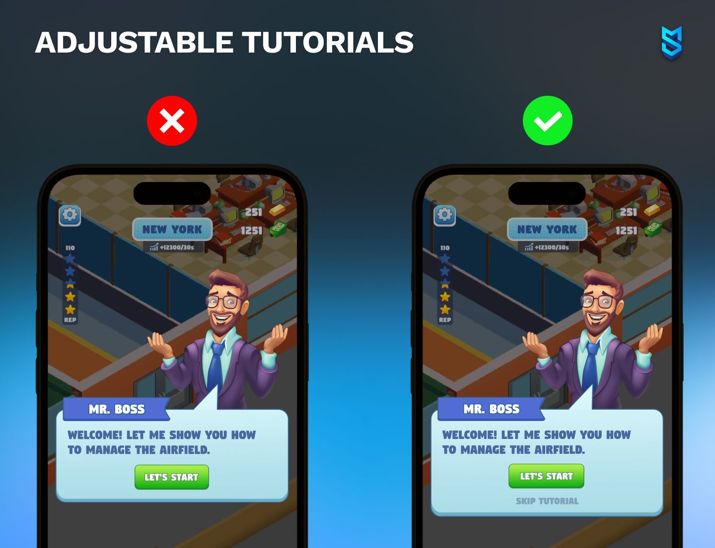
Mobile games have seen an influx of hardcore gamers in the last five or so years, and those kinds of players prefer their tutorials brief, since they know most of the ropes already. To cater to them, game developers are starting to offer a selection of tutorial types — with more or less detailed instructions. Of course, whether you need this or not will depend on the type of game you have in mind.
UI personalization
Personalization is a trend wherever you look, so it’s of little surprise that it came for mobile game UX design as well. Besides accessibility-related tweaks like font sizes and color contrast, it is also becoming increasingly popular to offer a variety of themes for games’ interface.
AI in UX
Artificial intelligence is another general tech trend that can and should be used to enhance players’ experience with video games. When it comes to UX for mobile games, specifically, AI can help with adjusting difficulty for each player, offering tutorials in a timely fashion, and even making IAP offers pop up when players are most inclined to make a purchase.
UI/UX for meta layers
Meta layers are that content that’s not the main focus of the game, but rather an extra layer to increase player engagement. It can be in the form of a new mechanic, narrative elements, or events.
Integrating meta layers seamlessly requires a lot of consideration from a UX designer. For example, using the game’s environment to guide players to the new addition instead of dropping pop-up messages on them might delight users and increase engagement.
A/B testing of UI/UX
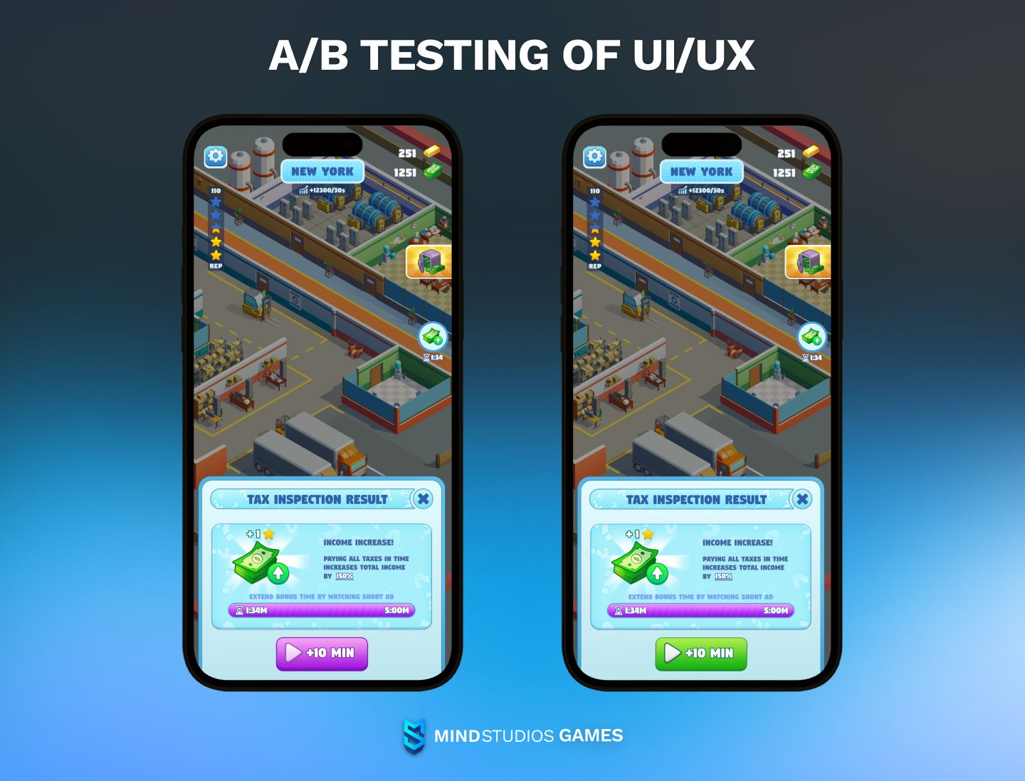
Testing is an indispensable part of game development, and performing A/B tests on your video game UX design can increase your game’s engagement and retention. The simplest example would be testing different titles and colors for buttons with Firebase Remote Config and similar tools.
At Mind Studios Games, we are currently developing our own tool that allows collecting all kinds of data for your games. Among other things, it will also enable game developers to effectively conduct A/B tests for UI/UX design.
VR/AR
Virtual and augmented reality offer both challenges and opportunities for mobile game UX design. Opportunities, because a more immersive experience for players is always a win for the game owner. Challenges, because it’s easy to do wrong — like The Walking Dead: Our World did.
However, it is undeniably a trend in games today, and for a UI/UX designer working in games, it’s something to keep up with.
Global success stories
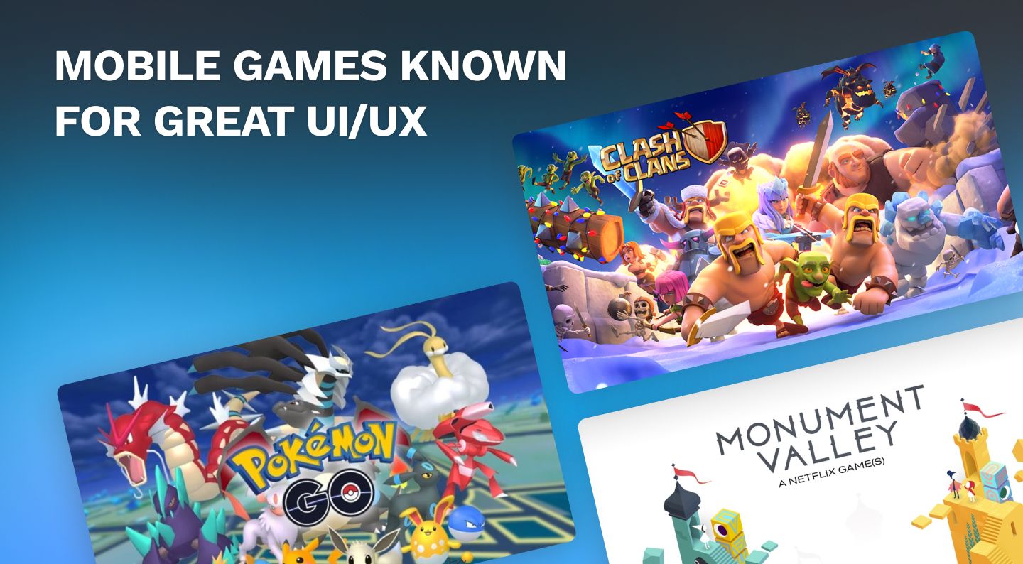
Did you know that UI/UX was one of the aspects Supercell's hit Clash of Clans was most praised for? The game's simple and clean interface, along with its easy-to-understand mechanics, helped attract and retain millions of players.
Another example of mobile games owing success, at least in part, to great UI/UX is Pokémon GO. The way its user-friendly design guided players through the game's features undoubtedly contributed to its widespread appeal and high retention rates.
“But those are Supercell and Niantic games, no wonder!” some might say. Well, here’s another one for you:
Monument Valley, an indie puzzle game by Ustwo Games, won a ton of awards, including the BAFTA Games Award for Mobile/Handheld Game, back in 2015. Alongside that, it was featured in a Netflix’s adaptation of House of Cards, and apparently has a movie of its own in the works. What set Monument Valley apart and earned it the acclaim were stunning visual design, innovative gameplay mechanics, and an intuitive UI/UX.
Game UI/UX with Mind Studios Games
Stories like the ones above inspire us and push us to pay more attention to our games’ UI/UX to win over more players. We employ our understanding of best practices and principles to the titles we build, and it pays off.
For example, our Nanobytes: Byteworld game had a 52% D1 retention not long after its launch — and we’re pretty sure our hard work on its UX and onboarding played a role there.
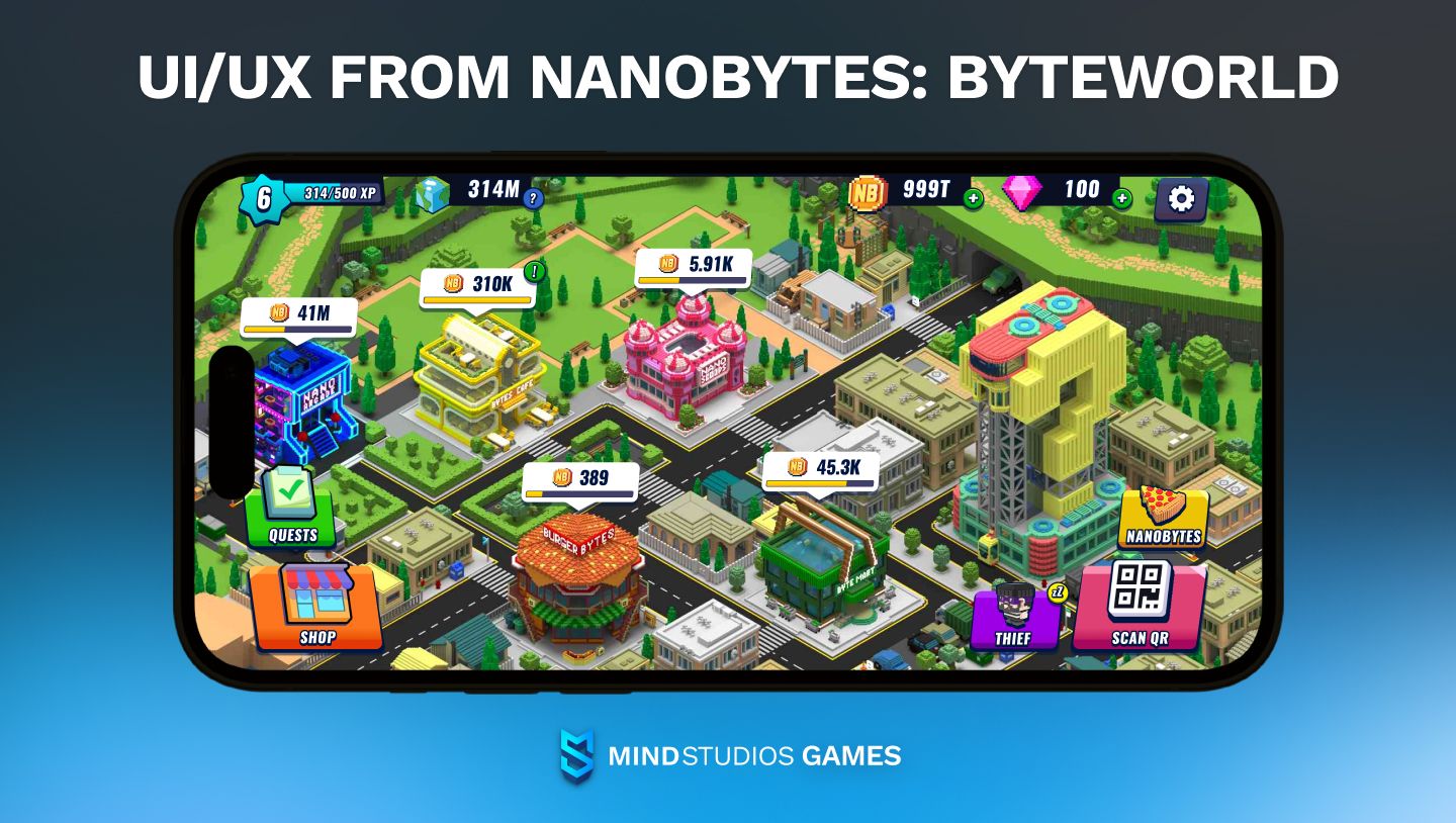
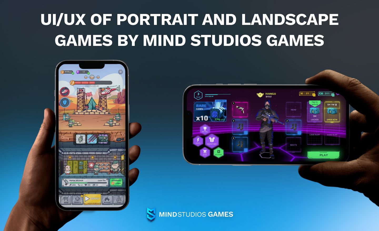
We know first-hand about the differences in approach to mobile game UX design for a variety of game types and genres, too.
We’ve built mobile games in both portrait and landscape mode. Our idle and hybrid-casual titles are, as is traditional, made in portrait: MyFishMart, Troop Tycoon, and our resent release — Rogue Runways, among others. On the other hand, we have landscape titles represented by CyberHero and the previously mentioned NanoBytes: Byteworld.
Conclusion
Creating a really lasting impression in today’s mobile game players is a tough task to tackle: the market is severely oversaturated and the competition is tight. Mobile game developers, especially indie ones, often need to create something visibly groundbreaking to have a chance of commercial success. Seemingly little things like the game’s interface might be put aside in favor of stunning graphics.
However, as history shows us, that’s not the best way to go, and success often tithers on these little things. Paying attention to your mobile game UX design and making it intuitive and not just eye-catching will pay off better than one might expect.
That’s why we at Mind Studios Games consider UI/UX designers to be one of the backbones of our games, and why we offer services like UX/UI for mobile gaming apps separately as well as in the full-cycle game development package.
If you’re interested in more information, require advice, or are looking for a talented UX designer with a focus on mobile games, look no further. Contact us for a free consultation, and we’ll offer you our expertise, realistic estimates, as well as qualified personnel on hire.

