Many company owners are questioning the importance of logo for a company. What is the purpose of company a logo and how to design a logo for online business? We will try to give an answer to these questions, with some info on online branding and logo design on top.
Remember the fabulous A.D.I.D.A.S. commercial that has been booming around the web recently?
The main idea of the rolik (apart from promoting A.D.I.D.A.S. goods, of course), is that people are different colors and sizes. No one on Earth is exactly alike - even brands. And what is the main sign of identity? Exactly, it is the brand rademark or logotype. But what is the importance of a logo?
Do not miss out on our best UI/UX practises article
Original is never finished.
As humans are mostly visual creatures, they tend to remember more visually attractive things. Following this logic, the importance of logos in marketing can’t be underestimated: logo is an exceptional part that makes your product stand out. The more recognizable it is - the more successful it could be called.
How important is a logo to a brand? As many resources as there are, the opinions might vary as well.
One of the hugest portals for hiring a freelance designer, 99 designs, explains the importance of logos in business: logos are symbols made up of text and images that help us identify brands we like. But they can be so much more! A good logo is the cornerstone of your brand. It helps customers understand what you do, who you are and what you value.
Business Dictionary offers a slightly different definition of importance of logo design and online branding: Recognizable and distinctive graphic design, stylized name, unique nested symbols, or other device for identifying an organization. It is affixed, included, or printed on all advertising, buildings, communications, literature, products, stationery, and vehicles. Not to be confused with a brand, which identifies a product or family of products. It also could be called logotype, but it doesn’t matter how you call it - what it represents matters more.
Look at the most successful digital brands - and their brandmarks
You can not mix them up with anything on in the world, can you? - because they are remarkable indeed.
There are a few things you need to know in order to design a logo for online business, and these insights also help to distinguish between “the good, the bad and the ugly”. Practise claims that decent logo is:
Simple
Product-associated
Memorable
Despite what many might say, logo design process has several stages to go through.
Briefing stage, where all the pre-project discussions happen. Designer has to keep in mind the goals of business he creates a logo for, where logo will be used and what is the target audience of the company.
Research stage. At this stage designer gets to work with branding research, establishing potential themes and colors. A fair point here is also to look at potential competitors, making the market research and analyzing which kind of design they already have.
Sketching, brainstorms, conceptualization. Again, at this point brainstorms normally happen, including the “keyword research”; it is a process when designers rack their brains and think of all possible words in the area, trying to implement the most relevant ones in the logo.
Making a draft-logo. Creative process is like a sea - it is constantly changing from calm to ill. When all the brainstorms calm down, a few drafts appear as the outcomes. At the same time designers test the way logo looks on different screens, ensuring that it looks prominent on both mobile and desktop screens.
Feedback and optimization stage. Careful testing leads to presenting a few the most efficient concepts to the client, to get the valuable feedback and implement the necessary changes.
Delivery and peculiarities. After all the stages of logo design, the most-awaited part for every product is the time when all improvements are over, and the product is ready to get approved by it’s owner and the future fans of his brand.
When you get to design a logo for online company, special attention should be payed to the type of logo you focus on; it needs to correlate with the business type and values. There are several effective types of logos in online marketing.
Types of Logos.
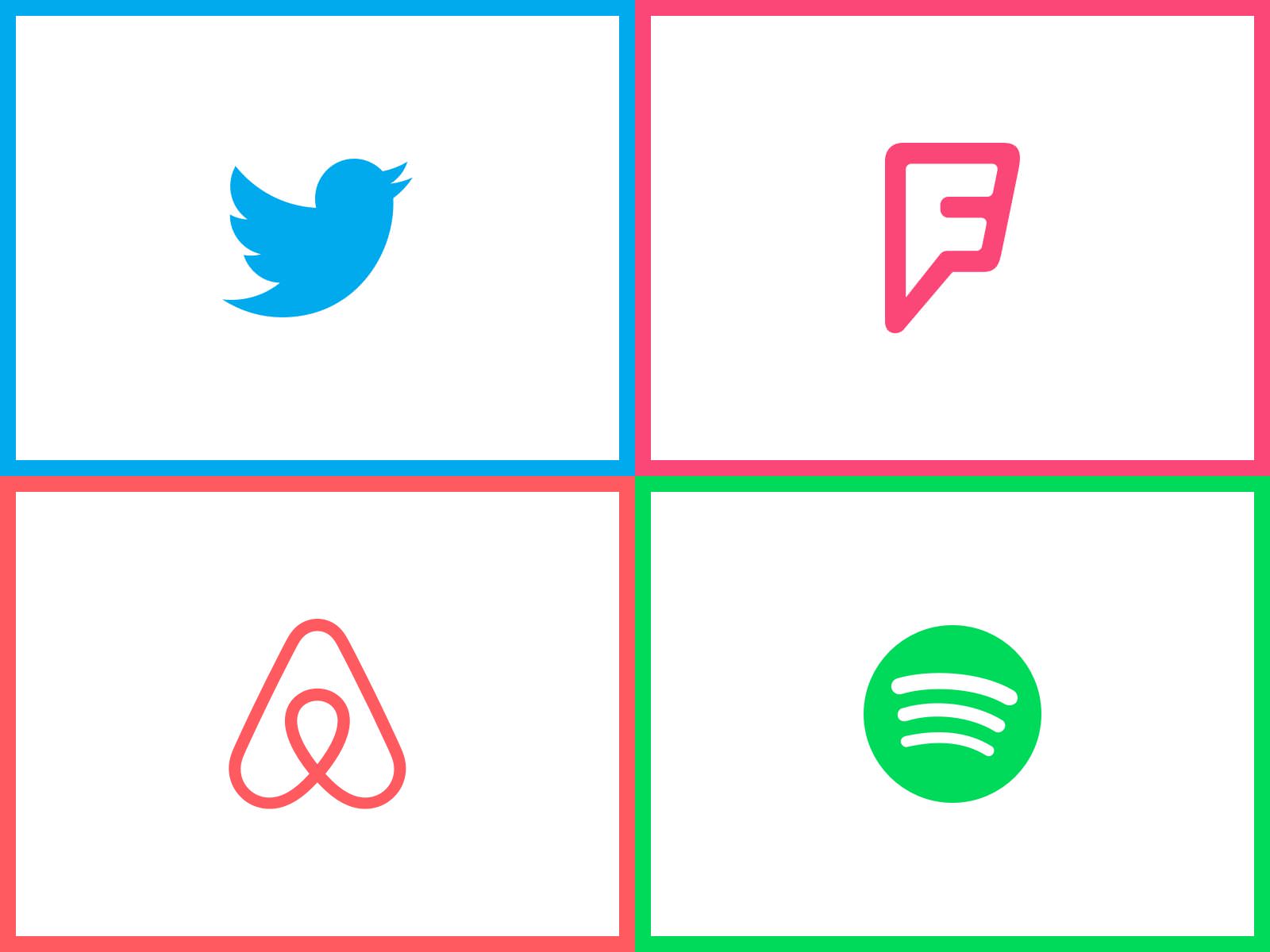
Pictorial logos.
Pictorial logos, sometimes called brandmarks, are basically a graphic image or a colorful icon. You probably see them on a daily basis, but you just don’t pay loads of attention to it - the epochal Apple logo, the drone of Android, the blue bird of Twitter mobile app are all on the list. The tricky thing about this kind of logos is to make a tiny icon easily-recognizable for the loyal consumers, using all the magic of forms and colors to help you.
![]()
Another type of pictorial logos is an abstract mark, same an iconic logo, but the icon is not recognizable this time - it’s more geometric and abstract. Nike, Pepsi and Carrefour are good examples of abstract logos, which give no information on the company’s products or services - but they rather let you create something sophisticated to represent your brand.
Mascot type.
Remember the Colonel Sanders from KFC’s logo? Colonel is a great example of mascot logo - a spectacled bearded smiley appeals to customers, presenting KFS as a welcoming organization at the same time. Mascots are a great way to deliver the brand atmosphere - just recall the exciting sport mascots each American team has.
![]()
Lettermarks.
There are brands whose names consist out of 2+ words, which is hard to memorize, let alone pronouncing it. Therefore, for firms like Home Box Office, Hewlett-Packard and Cable News Network is it essential to use initials, ensuring they look good on different types of printed production.
Wordmarks.
Brands like Ebay, VISA and Disney use a combination of a haunting company name and efficient lettering to obtain the essence of their brand. Typography is the most important matter in this logo type. For instance, VISA sticks to a heavier font - convincing customers to make payments via their service.
![]()
Combined Logo.
Or the combination mark, which has a very simple formula: wordmark/lettermark + a fancy icon. With the lettermark on top, outside or even combined with a picture, it’s a choice brands like Lacoste, Lays and Airbnb go for.
6. Emblem.
One of the awesome things about emblem logo is the amount of info about your business that you can fit into it: establishment date, whereabouts, adress,and much more. [Inspirationfeed] Designers tend to think it’s the trend of American public organizations, however, Starbucks, Porsche and Harley Davidson turn out the rumor to be false.
Branding Hints.
![]()
Creation of a custom logo for branding is a complete result-oriented process, as logos are intended to be the “face” of the company; with the help of fonts, colors and images they convey the basic values of the brand to the customers, making them intertwine with it. However, the result is equally important as the creative process is. Every designer has his own design flow to choose, and the own style to follow, and Mind Studios team are not an exception either. Here are a few tips to take into account once you start making a logo and the whole concomitant branding work.
Stay in the loop.
Fashion is everywhere, and even in terms of logos there are certain trends to follow. There are excellent resources like Logopond (Dribbble for logos) and Logobaker (for Commonwealth of Independent States mostly). Keeping a close eye on the trends will help make up your mind regarding the type and way you’d like your business mark to bear.
Here also is another hint - great Behance presentation on logo trends that has a great overview of the contemporary branding tendencies.
Consider competitors.
During your business analysis stage watch over the competitors’ logos - the type, fonts and colors they have. Practise suggests you use the ones that are missing in your opponents’ brand marks - to stand out of their crowd. We also advise you to be careful with selection - not more than 3 colors in the logo (in order to avoid the motley mish-mash).
Create of fill in a branding survey.
Internet is a bliss for marketing research. In recent years, there have appeared many logo & branding research forms that can be found online, to get a better understanding of company’s goals. Use this form or the similar polls to better understand your effective online branding tactics.
Branding On Luck.
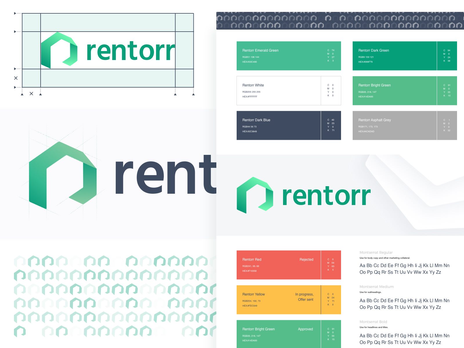
Here is an example of branding work we did for one of our clients - Rentorr, South African platform for property rental management.
Most of the logos listed in this article are the giant brands’ marks, so their popularity has a huge percentage of luck as well. Perhaps the business these logos were created for went viral, or the promotion did its job - one way or another, omnipresent logos are often a result of a well-thought branding and marketing strategy afterall. So what if your future logo is going to become elevated overnight? Nothing to worry about, just ensure your branded design is really mesmerising, following the types and practices we’ve listed above.
Or contact us to do our best for you and your brand!
Written by Vlad Tyzun, Julia Golovko and Elina Bessarabova