

It's not about huge, ridiculous things that we need to do. It's about tiny things that can make a huge amount of difference.
Paul Bennett, TED-talk “Design is in the details”
It is not only about the devil who hides behind the details - it is also about the design itself. We often hear that the less design - the better, and the top-meeting our expectations design is the one which is totally unnoticeable to a user it interacts with. But what are the best practices for ux design these days, and is it any different from what we used to “like” a year or so ago? Our designers have tried to implement the UX design best practices, letting their experience of working with mobile businesses speak for them.
1. Tab Navigation Bar vs Hamburger Menu
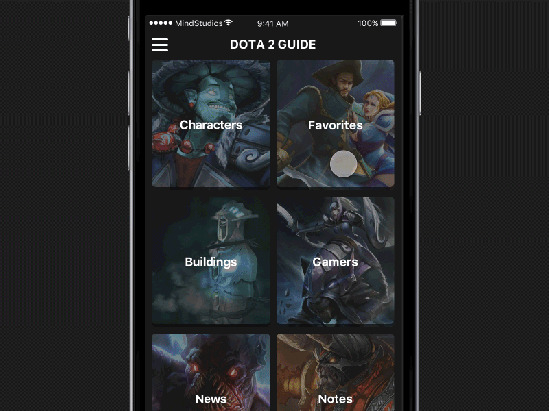
One of the best practices for mobile UX design. The difference between these two is noticeable for everyone who has ever worked with mobile interfaces, startups, and user experience best practices. In substance, the hamburger menu (or hamburger button) is a button placed typically in a top corner of a graphical user interface. It takes the form of an icon that consists of three parallel horizontal lines (displayed as ☰), suggestive of a list, and is named for its resemblance to the layers in hamburgers, pancakes, or a hotdog in a bun.
[Source: Wikipedia]
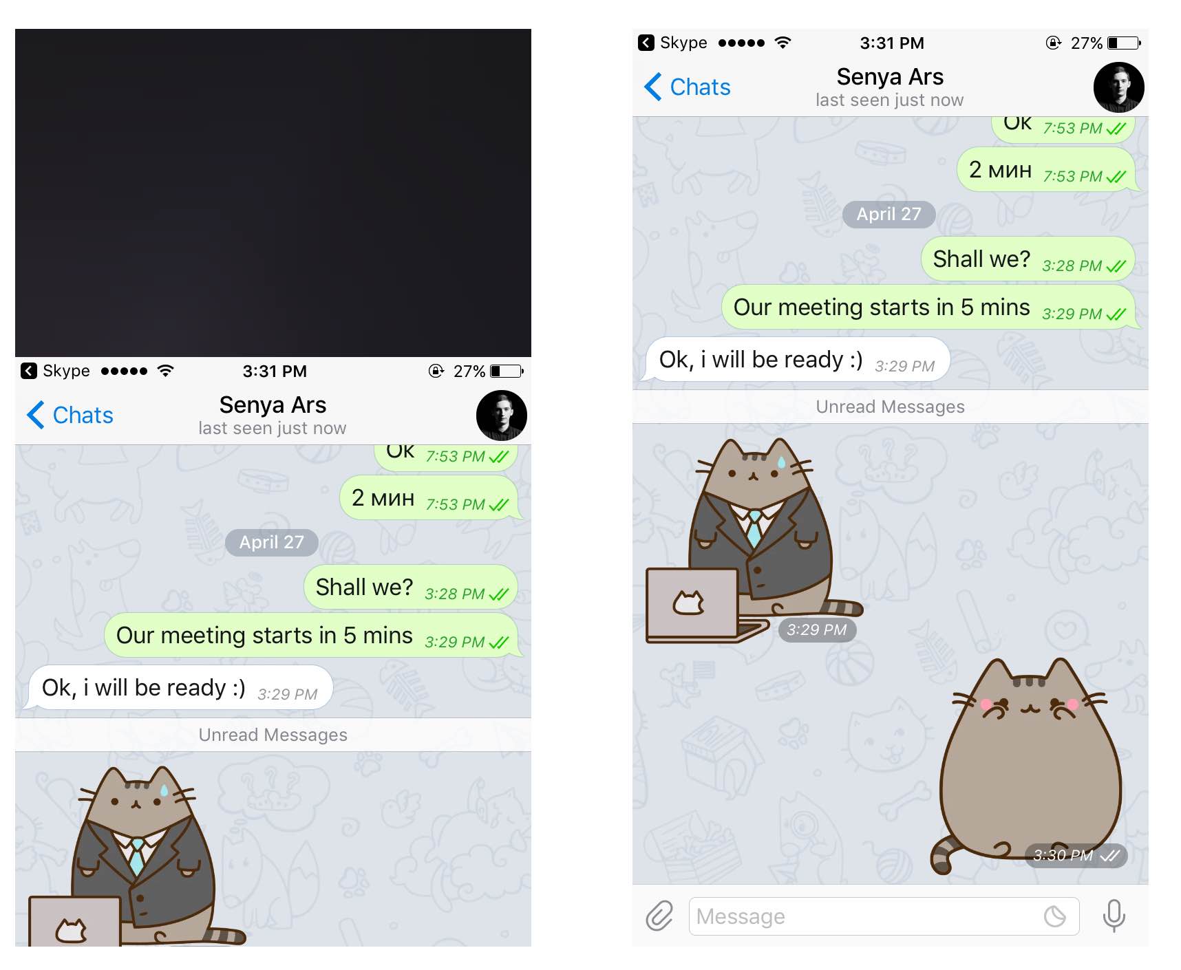
Here is an example of the burger menu implemented:
Those menus used to pop up everywhere on mobile, before the second Tab Bar option appeared. The menu is normally located at the bottom of the app’s screen and it’s main purpose is to let user simplify their mobile experience within this app. Frequently a tab bar would consist of 5 visible tabs, although there is no limit - just the device’s size and orientation. Tab bar navigation has proved to maximize the product’s usability in many ways it hasn’t yet.
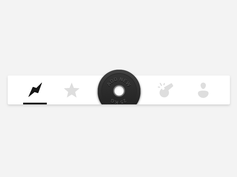
Only a year or so ago Awwards.com published several materials, related to design trends majorly; in their posts they acclaimed implementing the hamburger menu while designing for mobile devices, as this was one of the trendiest patterns during the years 2015-2016. However, as it was already mentioned in the “mobile application trends in 2017” article, the only thing you can predict about trends is that they will change. The same happened to the burger button - it has outlived itself. The tab-bar navigation is one of the most common practices these days, as it makes the interface look more accessible for a user, as well as it saves the tab history for them. Even though it is a responsive user-oriented option, yet it isn’t a custom user experience design best practice for every single application - for instance, Uber, Google Maps and many other popular cases do not require tabs to make in-app navigation easy for a user; though UX design trends suggest this button disappears in the future, and the safe choice for all the user experience best practices would indubitably be 5 or fewer tabs lower on the screen.
2. Interface Modality
Another best practice for mobile UX design. Remember the annoying alert screen that wakes you up every single morning? Well, the design term for this kind of interaction is modality. As a part of iOS Human Interface Guidelines, modality plays an essential role in building an interface-user dialog. The term modality in design basically means that a message or a task-complete overlays the app’s screen, and the user in their turn needs to make a choice whether to dismiss that or to read/view a message. Also, instead of the well-known back arrow you can generally spot an x icon, for the purpose of canceling the modal view. The x icon is of high importance here, as users need to spot a safe and obvious way to dismiss the modal task. Modality can also be presented in 4 parts:
- Full screen (covers the whole screen)
- Page sheet (partially covers the screen)
- Form sheet (centered on the screen)
- Current context (covers the parent view)
Modality is handy when you need to attract user’s attention to a certain point, but Apple strongly recommends not to overdose with various popovers - only when a task must be completed in order to continue using the app, or the info in the popover is really prior to keep up the application’s work.
Here is one of the examples of how modality screens should be implemented in mobile app UX design:
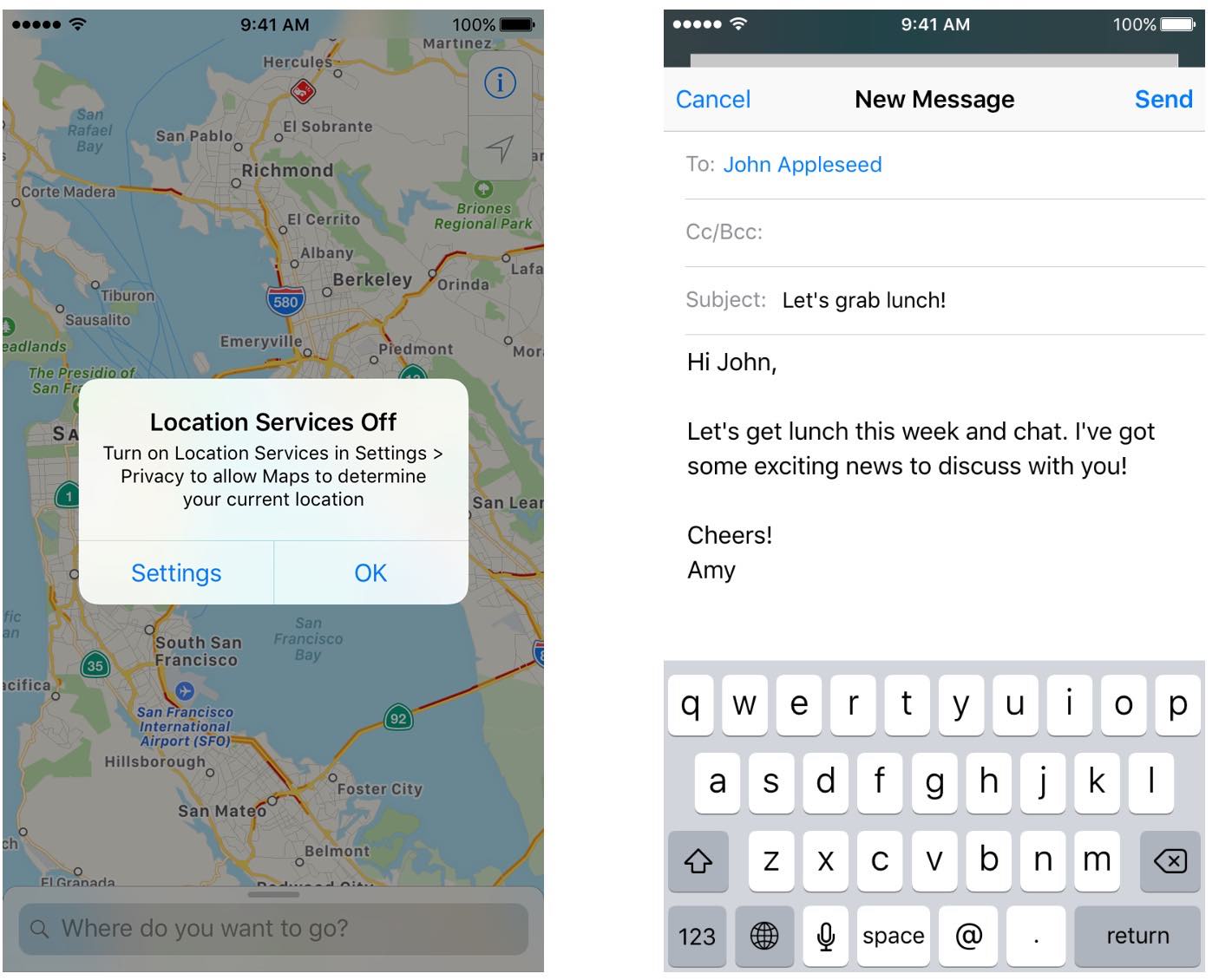
[Image source - iOS Human Interface Guidelines]
Another at-hand recommendation would be to make your modality popovers the least incentive - because users still attain the right to turn your app’s push-notifications off, and an incentive screen might tempt them to do so.
3. Content Segmentation
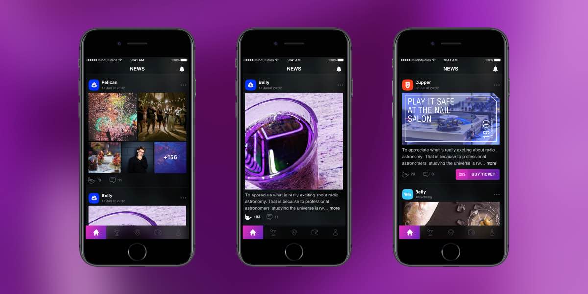
One of the most underrated best practices in UX mobile design. If you take Instagram, Facebook, Twitter or any other popular network - you get to notice the in-app feed consists out of the content of different types of content, and the best possible mobile app UX design is when the content is recognizable; when a user does not need to read the texts attached to understand whether it is a video or photo post as the thumbnails are self-explanatory. Here is the concept of an application advertising various night-life activities where the content segmentation was implemented.
4. Micro-interactions
Another UX mobile design best practice in 2022. A dime and a dozen materials have already been written about the essentiality of micro-interactions within the app. Every action of yours is mirrored by the interface itself, and the result of your actions respectively are those interactions.
The mobile UX design best practices we would recommend without a second thought would include the following:
- Animated placeholders
- Animated likes (if needed) - as these two improve the level of understanding your products establishes with users, improves the level of understanding created for and with them.
Quoting the head of Mind Studios design department Arsentiy Gorelik, “Design could be described as a perfect one if doesn’t rise any questions for a user”.
Instagram is a perfect example of responsive design work, with all the micro-interactions included.
5. 2-planes design approach
This mobile design best practice was used well before 2022 but still remains at the top. In spite of everything and previously mentioned mobile app UX design guidelines, designers often forget there are two planes where the development actually happens - x and y, those are vertical and horizontal dimensions respectively. They also are called linear and lateral thinking (according to the Interaction Design Foundation). One of the UX best practices of a mobile app is when the interaction with the in-app content is organized both horizontally and vertically; as every type of content is created for a different type of user cooperation.
For instance, Apple's double tap on the home button makes the content appear lower on the screen
When it comes to the Y plane, the swipes and gestures committed are examples of vertical interaction.
6. Interaction with the lists on mobile.
Well-aware, the listing happens differently on each platform - on iOS the list could be switched with a left swipe, and on Android it can be a long tap on the bullet list. Today’s smartphone trends suggest we’re shifting on to bigger, bulkier gadgets, so it only gets more and more complex to scroll down the whole device’s screen. So then, one of the mobile UX design best practices would be to move all the necessary interactions to the lower part of the main screen, to avoid undesirable user gestures.
The Interface of the Future

UX mobile design practice, and more specifically, interface design practice has come a long way before it appeared in the way we see them presented nowadays - yet this is not the peak of the whole interface evolution. As our mobile user experience design bravely suggests, an interface of the future will include all of the best iOS and Android design patterns and philosophies, mixing them all into one, flawless experience. While we hear the slogan of the future - “apps for all screens”, it means that the future applications are bound to become similar; are bound to look the same on all the platforms worldwide.
Here they are, the most loyal best practices in UX design we would feel safe to recommend when touching on the subject of graphic mobile design. The information given above mostly covers the UI/UX designer’s insights; nonetheless, with mobile website creation it may also appear handful, bearing some resemblance to the point. The smart era is here, awaiting you and your design to hop in - so maybe it would be a great time to stop holding your horses.
Written by Arsentiy Gorelik, Yulia Golovko and Elina Bessarabova.


